Sign makers are going digital using new best practices – Targeted Messages
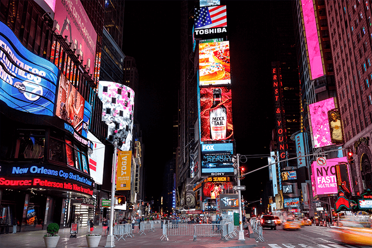
Sign makers today are increasingly becoming involved with digital signage—not only to provide the physical elements, such as hardware and displays, but also to generate the content that appears on the screen. It’s not always the easiest undertaking; however, it can be a game-changer when an attractive display is running compelling content. And sign designers are in a good position to do just that.

“Regardless of whether a designer is laying out a static billboard or a digital display, the skill is creating a visually compelling message that connects,” says Ryan Cahoy, managing director, Rise Vision, a digital content management company in Toronto, Canada.
Targeted Messaging
Cahoy says that the “less-is-more” model is the best practice when creating digital signage content. It is easy to be lured into throwing every possible element onto your screen, but it is probably best to make sure that the message is clear.
"Regardless of whether a designer is laying out a static billboard or a digital display, the skill is creating a visually compelling message that connects."
“A skilled designer recognizes that they need to use as few words as possible and with digital they have the opportunity to use subtle movement or animation to help draw eyes to the display,” Cahoy says. “So, there may be a little ongoing education about the technology to do animation, but a good designer or graphic artist can absolutely move into digital.”
It’s important to keep in mind how a viewer will consume the digital message. For instance, how much time will they have before they move away from the sign?
“Make sure the content fits the format,” offers Jody Smith, product manager at digital signage solutions provider Broadsign. “For example, it’s best not to display a text-heavy print ad on a highway-side billboard where the audience might only see it for three seconds.”
Jay Saret, business development manager for digital signage equipment distributor Almo Professional A/V, refers to this as “dwell time”—the length of time that a viewer allows himself or herself to be captivated by the sign. If the message can fit into this time—which is usually a small window—and be effective, then it has done its job.
“How long is the customer going to look at the screen?” Saret asks. “The content should be created based on the average amount of time it will be viewed. If it’s in an elevator or at a point in a line for a theme park ride, and the viewer is only going to see the screen for 20 to 30 seconds, then the content should be created with that time span in mind.”
Read Part 1 - Read Part 2 - Read Part 3 - Read Part 4
Article written by Ryan Fugler and reposted with permission from Sign & Digital Graphics.


