In 2017, staying on top of the latest typography trends is a matter of business success for designers, agencies, and other organizations that bank on graphical wizardry.
In addition to Pantone's colors of the year, the graphic design and printing communities have a host of other fads to look forward to. Here are some of the styles that are expected to be hot in 2017:
1. Large lettering demands attention
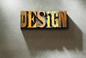
If you're designing a website or an advertisement to be featured on the side of a bus, there's no denying that oversized fonts are huge - no pun intended - in graphic design.
Not only does larger lettering look cleaner and more readable, but they demand attention. Enhancing font size is a great way to guarantee that everyone who sees your ads will read them and hopefully walk away with a positive impression. When you use this style of typography, though, it's best to keep information to a minimum so the ad doesn't look cluttered or overwhelming to viewers.
However, you should definitely include a link to the website or additional contact information so people can seek out the information they need.
"Fonts reminiscent of handwriting are familiar."
2. Handwriting gives ads a personal touch
There's a familiar charm that comes with fonts reminiscent of handwriting. People respond not only to the fact that handwritten font is personable, but also to the care in which it was perceivably written.
If you're creating a design for a feminine product, like makeup, you can use an ultra-feminine script, or if you want to keep it more gender neutral, opt for a casual-looking print. This sort of script is very popular on save-the-date cards and other personal forms of communication.
3. Serif fonts are coming back
While handwriting is great for casual, personable products and services, potential customers or readers may be looking for something a little more classic. Luckily, serif fonts are back in style.
Serif may look more traditional than handwriting and sans serif typefaces, but don't let conventionality keep you from putting a modern spin on your font of choice. Digital Telegraphy suggests steering clear of boring Times New Roman options and considering more impactful fonts such as:
- Georgia.
- Grad.
- Savoy.
- Sentinel.
- Eames Century Modern.
If these fonts are good enough for Rolling Stone, Vogue and The New York Times, you won't have any problem making them work in your designs!
4. Letterpress isn't going anywhere
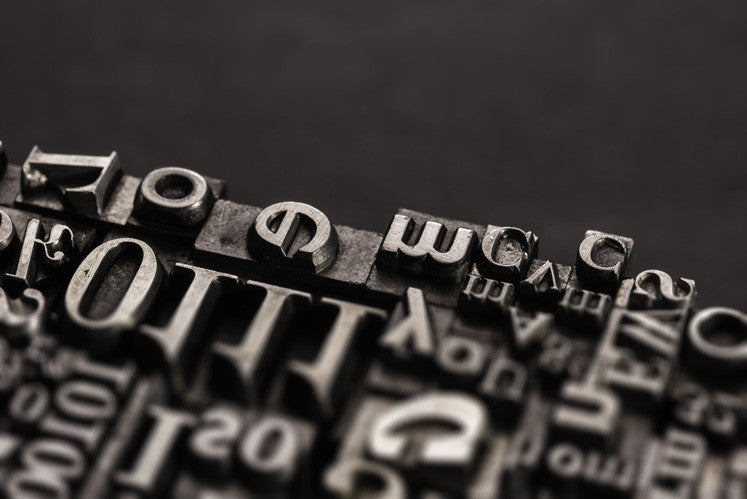
It's funny how fonts that originated on paper are becoming so popular for digital mediums. Like handwritten text, letterpress is a great way to make your design look modern and fun.
According to Elegant Themes, letterpress can refer to fonts that look like they were pressed into paper - with a three-dimensional look - or a mixed and matched retro look. Whichever style you opt for, there's no doubt that this trend that was strong all through 2016 is making its way into 2017 as well. The embossed look is very popular in web design and it's a great way to add a little more personality to traditionally conservative business communications.
